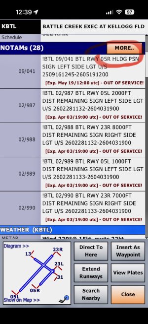
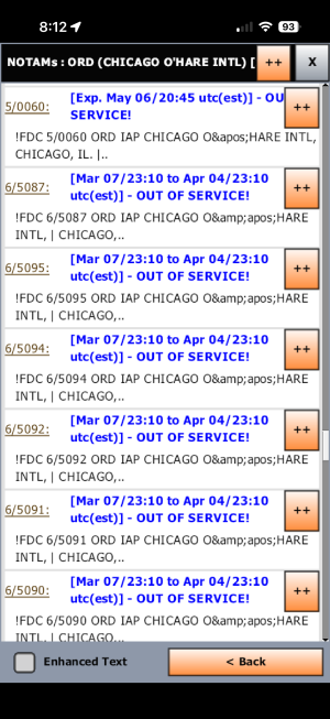
Please remove the “More” and “++” buttons and display all info at once.
The “More” button shows NOTAMs that are hidden for some “reason” (it’s not like the ones not hidden are more important than others…). A person may inadvertently scroll down too far making the “More” invisible, causing the pilot to miss that there are more NOTAMs than the ones visible.
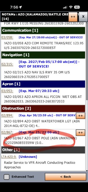
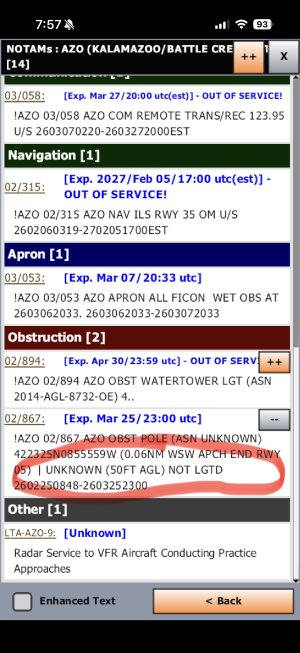
Also, eliminate the “++” button that, in most cases only shows one extra line that’s been hidden for some arbitrary reason (apparently there’s some”reason” to limit the initial display to two lines… cutesy?)
All these buttons do is add to the pilot’s workload.
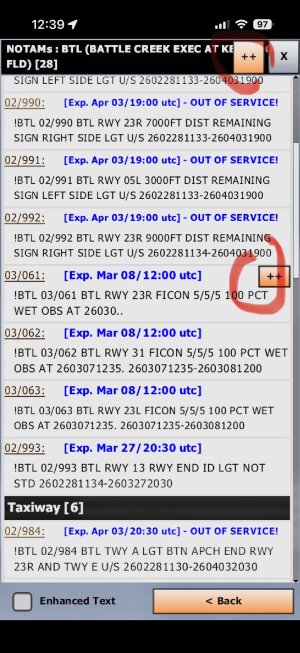
The “More” button shows NOTAMs that are hidden for some “reason” (it’s not like the ones not hidden are more important than others…). A person may inadvertently scroll down too far making the “More” invisible, causing the pilot to miss that there are more NOTAMs than the ones visible.
Also, eliminate the “++” button that, in most cases only shows one extra line that’s been hidden for some arbitrary reason (apparently there’s some”reason” to limit the initial display to two lines… cutesy?)
All these buttons do is add to the pilot’s workload.