I agree that the winds aloft data via a briefing in iFly EFB is basically unusable primarily due to the way things align, but also how on smaller screens the text wraps making it even more difficult to read. A table with borders that didn't wrap would be ideal. I wonder if it was presented in a monospaced font (like courier) it would help. Perhaps turning off the text wrap which would require us to scroll left and right to see the entire data.
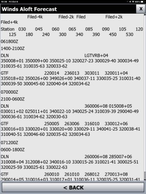
I have found that if I tap on an airport, select the WX tab, click on the "Wx Info..." button and then select the "Winds" radio button, a more readable format at that station and at nearby stations is presented. It looks good on tablets, too. This could be a good workaround while we wait for AP to acknowledge this issue and work on a fix. Here is an example of what is presented in Windows:
View attachment 464